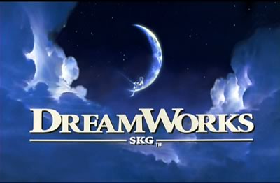
The logo for DreamWorks uses bold, white font on a dark background of clouds. Due to the colour contrast of the background and font, the writing stands out a lot more to the audience. Examples of past and future releases of the thriller genre include 'What Lies Beneath' (2000) which is an American supernatural horror-thriller film. It stars a couple who experience a strange haunting that uncovers secrets about their past. 'I Am Number Four' (2011) has a action as the sub-genre. It is about a man who is a fugitive on the run from ruthless enemies sent to destroy him.
Warner Bros. Pictures
The main colours of this logo are gold and blue which are very contrasting colours. The bold letters WB feature in the background, these are well-known and recognisable to many people. One thriller from this production company is 'Deathtrap' (1982) which is about a Broadway playwright who puts murder in his plan to take credit for a student's script. Also, 'A Perfect Murder' (1998) which is a remake of the Hitchcock classic dial "M" for murder.

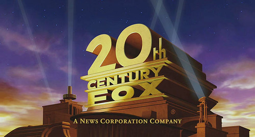
20th Century Fox
The 20th Century Fox logo is very well-known because of the grand, gold building which is surrounded by spot lights which portray a cinema feel. The writing and font is very large and bold which stands out in the evening sky, this could be to symbolise the way people tend to visit the cinema as an evening activity, therefore being very suited to it's purpose. 'Speed' (1994) is an example of a thriller from this production company, it's sub-genre is action. It is about a young cop who must save the passengers of a bus that has a bomb set to explode if the bus goes below 50 MPH. Another example is 'Hide and Seek' (2005) a psychological thriller about a widower who tries to piece together his life in the wake of his wife's suicide, his daughter finds solace at first in her imaginary friend.
No comments:
Post a Comment